I thought I’d take a break from the organizational series I’ve been posting most recently and talk about one of my favorite aspects of running this little company: the art. As much as I love organization, my first love will always be creating. I would like (if you’ll permit me) to start blogging about the designs, techniques, and special details of the pieces I create from time to time. When your storefront is online, customers may miss out on the story and process behind a piece and I’d like to remedy that here.
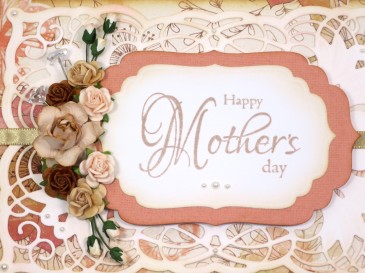
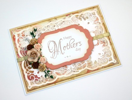
I’ve been experimenting with a lot of different techniques lately and I’ll have to link to some of the fun cards I’ve created with them later, but for this Mother’s Day card, I figured that I’d get back to some of the embellishments that are nearest and dearest to my heart.
If you’ve read my blog post on Die Organization, you know that I absolutely adore them. I think that some of the designs out there are breathtakingly captivating if used correctly and I attempt to do so from time to time. For this card, I selected the Spellbinders Nestabilities Four dies and relatively new one from Spellbinders and Becca Feeken of Amazing Paper Grace to give my design its basic shape.
For my color scheme, I wanted something that was a departure from my typically preferred bold blue and purple hues. I’m trying to use some of my neglected 12×12 paper collections, so I selected a set with some shabby pink, peach, and brown tones. At first, I combined the patterned papers with an unaltered white die cut, but it just seemed too white. The addition of a few colors of Distress Ink later, my background die cut matched the muted tones of the papers I’d chosen.
Next, I sized the Nestabilites for my Happy Mother’s Day stamp and cut two shapes in white and peach. I added Distress Ink to these pieces as well. Now, I’ll admit that when I’m die cutting a for a sentiment, I tend to stamp the sentiment FIRST and then cut it out. Its TONS easier to make sure that the image is centered and stamped completely this way.
After placing all of the pieces together, it felt like I was still missing a color, so I added the piece of antique gold ribbon from the Paper Source behind my sentiment to pull it together a little better. I thought some dimension might be appealing, so I stuck foam adhesive behind my sentiment blocks and used a permanent adhesive runner to secure all of my layers in place.
Lastly I misted some of my roses with a delicate gold and took a few ink daubers to the rosebuds before arranging them to the left of the sentiment. A few pearls later…voila, a card that will certainly make Mom smile.
If you’re interested in any of the products I used, I’ve listed them here:
- Tim Holtz Distress Ink – Tattered Rose
- Tim Holtz Distress Ink – Vintage Photo
- Tim Holtz Distress Ink – Antique Linen
- Tim Holtz Distress Ink – Spun Sugar
- Recollections Pearl Embellishments
- Paper Source Satin Ribbon – Antique Gold
- Spellbinders Nestabilities – Labels Four
- Spellbinders Amazing Paper Grace Dies – Cascading Grace
- DCWV 12×12 Paper Stack – Garden Tea Party
- Tattered Angels Glimmer Mist- Gold
- Tsukineko Brilliance Ink Pad – Pearlescent Beige
If you think this handmade card is perfect for someone you know, you can find it here.
If you’d like to see any of my other products or you’d like to request a custom order, please send me a message or visit Aluminum Butterfly on Etsy.
