Mini Party Invitations with Candy Cane Lane

Hey Stampers,

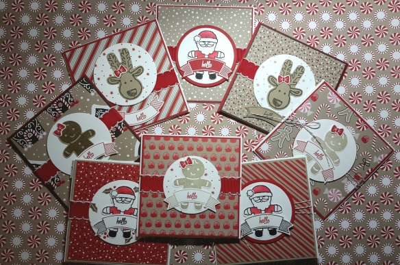
Today I want to show you how I made a set of adorable invitations for my Stampin’ Up! holiday catalog launch party using the Candy Cane Lane suite. They’re mini, they’re magical…they’re too cute for words! Yep, the little critters you can make with the Cookie Cutter Christmas punch have totally stolen the show this year, so I just knew I needed them on my launch party invitations.

holiday16_p06b-50

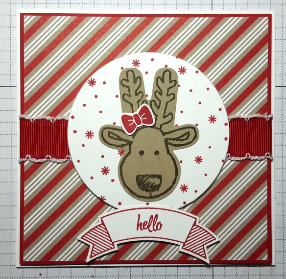
I started by pairing the coordinating Candy Cane Lane Designer Series Paper with one of the characters from the Cookie Cutter Christmas stamp set and then added matching cardstock. My card bases are cut from Whisper White thick cardstock at 4.25×8.5 inches (creating a card that’s 4.25 inches square) and scored at the midline. I cut my designer series paper to 4 inches square and sized my cardstock to provide a frame of an eighth of an inch. For this card, I used Crumb Cake cardstock and Early Espresso ink on the reindeer.

Studio_20160820_105109

For the background on my circle, I used a stamp from the Presents and Pinecones set and Real Red ink. You could also use designer series paper here if you wanted to, but I like the added support of the Whisper White thick cardstock behind my reindeer.

Studio_20160820_104906

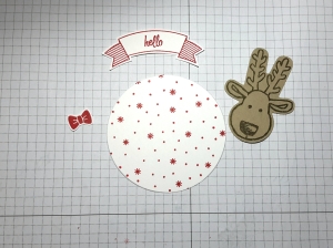
I adhered the designer series paper and cardstock together before adding my stitched edge ribbon (or baker’s twine). I mounted my background to the folded cardstock base and then I used dimensionals to adhere the framelit circle in the center of my card.

I added my reindeer to the center of my circle with Fast Fuse and then stamped, punched, and adhered my sentiment for a finished card. That’s it!

Studio_20160820_103932

I’ve included all of the products that I used to make the full set of invitations below. Please leave a comment or send me a message if you have questions. If you’re inspired to make something after reading this post, I’d love to see it!

Studio_20160818_223832

Happy Stamping!


Stamp & Pamper Dallas is Tomorrow!

We’re super excited that our Stamp & Pamper Dallas event is finally here! Whether you’re new to papercrafting or an experienced crafter this is something to get excited about. If you love Perfectly Posh or just like spoiling yourself a little with great products this is the place to be. There will be demonstrations, there will be make & takes…there will scrubs, lotions, potions and wine! Tami and I will be featuring items from our respective catalogs and we will (of course) be available to take orders on the spot! It’s bound to be a day of good fun for hard-working women who deserve the time to relax and enjoy themselves.

If you missed this one, but would like to host one for your besties, let me know! We’d love to throw a party with you.

Adding Depth with Layering Stamps

Move over basic stamping! The days of simple cross-hatched patterns for shadows are over. Okay, maybe that was overly dramatic. I love all of my stamps, but recently I discovered that designers are creating layering stamp sets that can turn any project into a fabulous one very quickly.

These sets contain multiple images that are intended to be stamped on top of each other to create depth. It’s a process that seems similar to operating a printing press: one pass (or in this case stamp) per color to yield a final image. These sets are comprised of clear stamps that make lining up each image easier.

This year at Scrapbook Expo in Grapevine, TX, I took a class using Just Rite’s multi-step Wild Roses set. Instant love. The beautiful patterns and limitless color options allow crafters like me (with no real artistic ability) to add a little more magic to my cards.

These stamps are fun and relatively easy to use, but buyer be warned: some stamps sets are easier to line up than others. Some sets claim that each layer isn’t designed to fit perfectly on another and that it makes it easier to create with. I found some of those sets to be incredibly frustrating to work with. Still others had far too many layers and they created and mottled image that was hard to distinguish. Now that I’ve tried a few brands here are my favorites (saving the best for last):

  • Hero Arts:

I used the Hero Arts Large Orchid set to create the Mother’s Day card below in pigment inks. Lining up the stamps was fairly easy and I found that this set was pretty forgiving if the images weren’t lined up 100% correctly. The layers came together well to create a realistic looking quality orchid stamp that I could proudly use the matching dies to cut out and use on my card.

  • Just Rite:

While taking that class at Scrapbook Expo we used the Romantic Wild Rose stamp set from JustRite. I found it to be relatively easy to use and the components yielded themselves nicely to creating different scenes. This set is full of two stamp images that come together very quickly and don’t require you to have a lot of different inks to differentiate layers. The anchor points on the stamps made determining orientation easier than some of the others I’ve tried and the images laid on top of each other well using pigment inks.

  • Altenew:

Talk about a knock it out of the park, holy crap where have you been all of my life product. I’ve adored (read: drooled over) every single image I’ve seen created with the Peony Bouquet and Beautiful Day stamp sets by Altenew. They’re just phenomenal stamps. The patterns are so versatile and have so much depth to them that anything created is an instant masterpiece. I’ve yet to try pigment inks with them, since the details are so intricate, but dye inks work beautifully. These sets lend themselves well to multi-layer stamping, embossing, or watercolor. The possibilities are endless!

I have several more Altenew stamp sets I’ve yet to try and I’m so impressed with the ones that I’ve used that I can hardly wait to use them! Have a favorite brand, set, or technique? Tell me about it in the comments section!

If you’re interested in any of the products I mentioned, I’ve listed them here:

  • Hero Arts Layering Stamps – Large Orchid
  • Just Rite Stamps –Romantic Wild Roses
  • Altenew – Beautiful Day, Peony Bouquet

If you think these handmade cards are perfect for someone you know, you can find them here.

If you’d like to see any of my other products or you’d like to request a custom order, please send me a message or visit Aluminum Butterfly on Etsy.

*I’m not affiliated with any of these companies…I just like their stamps!

Watercolor…with Distress Inks?

As much fun as I have shopping, I’m always on the hunt for new techniques to try with things I already have. Its kind of like finding money in a coat pocket that you weren’t expecting. So when I stumbled upon new ways to take advantage of the water reactive properties of Tim Holtz Distress Inks, I decided to give it a try.

I fell in love with Distress Inks years ago and over time I’ve collected a few (read all) of them. I’ve used them in any number of ways to dye, tint, edge, stamp or distress my projects, but I’d never thought of combining the ink with water before I put it on the paper. Recently, a technique video  or twelve “taught” me how to use my ink collection to watercolor.

I started with a stamp with a solid outline and plenty of open space: in this case, roses. I stamped my image in a clear ink and used white embossing powder to serve as my outline. Now a white outline on white paper isn’t the easiest to see, but the contrast with the inks makes the finished product fantastic.

Once the embossing powder cooled, I taped my project to my craft sheet with washi tape to reduce movement and paper warping and picked a few colors for my roses. I chose a few shades of yellow and orange and two shades of green. For this technique, I simply turned my inkpad upside down and tapped it on my craft sheet (one spot per color like a mini pallet). I used a VERY small container for my water, since I was using a 110lb cardstock instead of watercolor paper and I wanted to force myself to keep extra water to a minimum.

I wet my brush and then touched it to the colors of ink on my craft sheet working lightest to darkest on the petals and then leaves and set it aside to dry. I should mention before I move on to the rest of the details on this card, that applying the ink directly to the craft sheet makes it much easier to blend colors before adding them to your project, thus reducing the change of wrecking your paper if you’re stubborn like me and won’t use your watercolor paper.

YP3
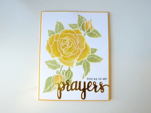
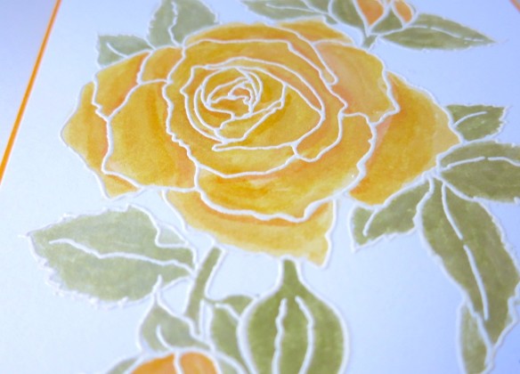
While my image dried I took out my Prayers stamp set from Hero Arts and die cut the word from gold cardstock. Once dry, I placed my roses in my MISTI stamping tool and arranged my sentiment stamp just above where I intended to place my die cut. You don’t need a MISTI for this project, but I’ve found that I like using the gridlines to make sure my stamps are straight. I also love that if an image doesn’t stamp perfectly, I can re-ink the stamp and close MISTI again, placing the stamp in EXACTLY the same place as the last image. I find this to be an extra precaution I like to take when I’m adding a sentiment to a piece that I’ve already put quite a bit of work into.

YP4

I was about to adhere my die cut when I decided that this card needed a yellow border. I like to cut my border pieces just a quarter inch larger than my focal piece for cards like this for a little added interest. Here’s how it looks assembled…ready to fill an envelope with comfort and thoughtfulness.

YP2

If you’re interested in any of the products I used, I’ve listed them here:

  • Stampendous Cling Rubber Stamp – Timeless Rose
  • Tim Holtz Distress Ink – Wild Honey
  • Tim Holtz Distress Ink – Tattered Rose
  • Tim Holtz Distress Ink – Mustard Seed
  • Tim Holtz Distress Ink – Shabby Shutters
  • Tim Holtz Distress Ink – Bundled Sage
  • Hero Arts Stamps and Die Set – Prayers

If you think this handmade card is perfect for someone you know, you can find it here.

If you’d like to see any of my other products or you’d like to request a custom order, please send me a message or visit Aluminum Butterfly on Etsy.

Dahlia Thinking of You Card

Okay, I’ll admit it: I have a new obsession. I have fallen completely head over heels for Derwent’s Inktense pencils. They’re a water soluble paint type pencil set that make watercoloring my new favorite thing. I don’t own any standard watercolors and I only have one other set of watercolor pencils. There’s a reason for this–I can’t draw. The fancy coloring and shading that some crafters pull off with Copic markers baffles me. This is a talent I simply don’t possess (and I’m a little jealous). I would normally shy away from anything that would expose this weakness, but once I watched a few YouTube videos on them, I was so taken by their bold hues that I just had to try them for myself.

inktense1

Now I’ve told you that I don’t draw and if you’re like me, you’ll depend on your stamps and stencils to outline your images. When I’m working with any watercolor technique, I use Staz On ink or any other brand that won’t run when I start working with water. I chose a recently acquired Heartfelt Creations stamp set for my image on this card and then selected what I thought might be an appropriately vivid color for my flower.Studio_20160319_201821

Boy was it ever. After taping my cardstock to my craft sheet with washi tape, I used my Inktense pencil to color in my flower where I wanted the shades to be darkest. I thought the bases and tips of the petals might look nice and left the petals plain white in the middle. Here comes the magic. With a detail waterbrush, I blended the color from base to tip on each petal for my highlights. No seriously–that’s it. I was thrilled with how easily the pencil blended using water alone. It blended with so few strokes and so little water that I didn’t have to use watercolor paper.

While my flower dried, I stamped the image a second time on some masking tape and cut the image out to use as a mask. I placed it over my colored image (once dry) and stamped the flourishes and leaves with Staz On Jet Black ink. I left the mask in place and used Tumbled Glass Distress Ink to color in my background. After coloring in my leaves, I thought the card front could benefit from a border to balance out the color. I took the same colored pencil from the flower to the border of a piece of cardstock and blended them with my waterbrush so that intensity would match.

The addition of a Heartfelt Creations sentiment and a little sparkle on the petal tips with my Wink of Stella glitter pen finished a card to send to someone on your mind.

DT3

If you’re interested in any of the products I used, I’ve listed them here:

  • Derwent Intense Pencils
  • Tim Holtz Distress Ink – Tumbled Glass
  • Heartfelt Creations – Dhalia
  • Heartfelt Creations – Sentiment
  • Wink of Stella Glitter Pen – Clear Glitter

If you think this handmade card is perfect for someone you know, you can find it here.

If you’d like to see any of my other products or you’d like to request a custom order, please send me a message or visit Aluminum Butterfly on Etsy.


Muted Rose Happy Mother’s Day Card

I thought I’d take a break from the organizational series I’ve been posting most recently and talk about one of my favorite aspects of running this little company: the art. As much as I love organization, my first love will always be creating. I would like (if you’ll permit me) to start blogging about the designs, techniques, and special details of the pieces I create from time to time. When your storefront is online, customers may miss out on the story and process behind a piece and I’d like to remedy that here.

I’ve been experimenting with a lot of different techniques lately and I’ll have to link to some of the fun cards I’ve created with them later, but for this Mother’s Day card, I figured that I’d get back to some of the embellishments that are nearest and dearest to my heart.

If you’ve read my blog post on Die Organization, you know that I absolutely adore them. I think that some of the designs out there are breathtakingly captivating if used correctly and I attempt to do so from time to time. For this card, I selected the Spellbinders Nestabilities Four dies and relatively new one from Spellbinders and Becca Feeken of Amazing Paper Grace to give my design its basic shape.

For my color scheme, I wanted something that was a departure from my typically preferred bold blue and purple hues. I’m trying to use some of my neglected 12×12 paper collections, so I selected a set with some shabby pink, peach, and brown tones. At first, I combined the patterned papers with an unaltered white die cut, but it just seemed too white. The addition of a few colors of Distress Ink later, my background die cut matched the muted tones of the papers I’d chosen.

Next, I sized the Nestabilites for my Happy Mother’s Day stamp and cut two shapes in white and peach. I added Distress Ink to these pieces as well. Now, I’ll admit that when I’m die cutting a for a sentiment, I tend to stamp the sentiment FIRST and then cut it out. Its TONS easier to make sure that the image is centered and stamped completely this way.MR3

After placing all of the pieces together, it felt like I was still missing a color, so I added the piece of antique gold ribbon from the Paper Source behind my sentiment to pull it together a little better. I thought some dimension might be appealing, so I stuck foam adhesive behind my sentiment blocks and used a permanent adhesive runner to secure all of my layers in place.

Lastly I misted some of my roses  with a delicate gold and took a few ink daubers to the rosebuds before arranging them to the left of the sentiment. A few pearls later…voila, a card that will certainly make Mom smile.MR7

If you’re interested in any of the products I used, I’ve listed them here:

  • Tim Holtz Distress Ink – Tattered Rose
  • Tim Holtz Distress Ink – Vintage Photo
  • Tim Holtz Distress Ink – Antique Linen
  • Tim Holtz Distress Ink – Spun Sugar
  • Recollections Pearl Embellishments
  • Paper Source Satin Ribbon – Antique Gold
  • Spellbinders Nestabilities – Labels Four
  • Spellbinders Amazing Paper Grace Dies – Cascading Grace
  • DCWV 12×12 Paper Stack – Garden Tea Party
  • Tattered Angels Glimmer Mist- Gold
  • Tsukineko Brilliance Ink Pad – Pearlescent Beige

If you think this handmade card is perfect for someone you know, you can find it here.

If you’d like to see any of my other products or you’d like to request a custom order, please send me a message or visit Aluminum Butterfly on Etsy.

Die Organization

If you’re like me, you’ve simply fallen in love with thin metal dies like those from Spellbinders and Sizzix. I love them…which meas that storing them quickly became a huge problem. At first, I tried a small ArtBin container. Then I moved them into binders,  but when that became untenable (ridiculously heavy), I got realistic. What I needed was something that could store the dies that I had, but still leave me room to grow without becoming a bulky (and expensive) mess. Stamp-n-Storage to the rescue!

IMG_2661
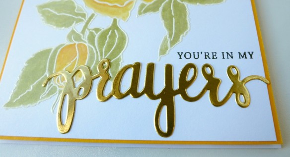
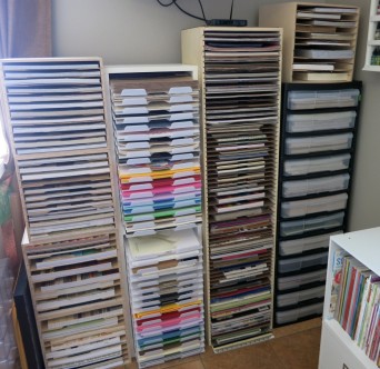
No, I’m not affiliated and I’m not getting paid for this, I’m just that happy to be organized. They make Die Totes that hold (correspondingly awesome) Magnet Cards. This combination has allowed me to store my dies by set and by category in a card catalog fashion. Holiday dies? Tags or labels? No problem! Simply placing my die sets on their respective magnet cards made keeping them organized and visible a breeze. Each pack of magnet cards now comes with a set of dividers…which means that I no longer need to guess where one category of dies ends and the next begins. When I’m not using them, they store neatly on top of my cabinet…instead of scattered all over my work surface.

I keep the labels from each die set and add them to my quick reference binders. These binders not only allow me to flip through all of my dies quickly when I’m working on a project, but also keep me from buying repeats when I’m shopping for more dies!

There are TONS of ways to store dies (I’m by no means an expert), but this is the way that works best for me. Why not give it a try? If you want to see what I make with my dies, check out my Etsy store here. Have questions or want to see more pictures? Leave a comment or send me a message, I’d love to know what you think!

Paper, Paper, Paper

IMG_2629

So paper…without it I would have a lot of pretty, but otherwise unrelated items in my studio. Millions of dollars annually (and maybe secretly) are being spent on different types, shapes, sizes, and colors of awesome paper products for everything from text books to scrapbooks. My husband would have you believe that I single handedly keep the decorative paper industry afloat, but I assure you that it is not the case. I do however, have some options for projects and I have to store them…somehow.

Best Craft Organizer makes both small and large paper racks that can store paper at an angle or level (depending on how you arrange the pegs). I have the small shelves stacked one on top of the other and that seems to work well for my open cardstocks. For my papers, like many things, I’ve found that if I can’t see it, I won’t use it. While stockpiling tons of specialty papers is fun, I’d rather use them than shove them in a drawer. You heard me…I literally had drawers of paper. It was a pain to get into them and I avoided the papers that I couldn’t reach (and then promptly forgot about them). So I decided to try a few different methods of sorting my papers into shelves. I had iris containers full of paper pads in 12 x 12. I’ve moved most of my papers into shelves from Stamp-n-Storage and Best Craft Organizer.

Stamp-n-Storage 12×12 Paper Holder

The Stamp-n-Storage paper shelves are sturdy wooden shelves that lend themselves well to stacking. Some crafters prefer to store them on their end as opposed to horizontal, but maybe I’m a traditionalist.

They make shelves to hold 12×12 and 8.5×11 paper, though I prefer to buy 12×12 shelves for both sizes because if gives me the greatest amount of flexibility. I purchased several that sit stacked on top of each other and they support the weight well. For those with Ikea Expedit or Kallax shelving, they make sizes specifically to fit these units.

Best Craft Organizer Paper Rack – Small

Best Craft Organizer makes both small and large paper racks that can store paper at an angle or level (depending on how you arrange the pegs). I have the small shelves stacked one on top of the other and that seems to work well for my open cardstocks.

For my smaller sizes (4×6 and 6×6), I use a method I borrowed from Jennifer McGuire Ink. She’s using Interdesign acrylic bins to organize her stamps and dies and I’ve adapted that method for my smaller paper packs. I can flip through them easily, use what I want, then return the rest.

At the end of a project, I’ve found that the best way to get a handle on the craftermath (yep, I said it) is to have a simple way to deal with my paper scraps. I’m reusing IRIS containers that I used to use for my stamps to hold scrap paper by color family. I can pull out the thin container, easily find a scrap for die cutting or stamping and then sweep the rest of the larger scraps back into the container. Easy, peasy.

How do you store your paper? Do you have a better way? I’d love to here about it! Leave a comment. Want to see what I do with all of that paper? Visit my Etsy store, here.

Keeping Crafts Organized

ink header There are so many tools and supplies available for crafting that the sky would seem to be the limit. In actuality,  that limit is more likely to be the size of your crafting space. I’ve scoured the internet searching for what I thought might be the very best ways to store my tools and supplies in a fashion that keeps them both organized and accessible.

1350958902036Yep, its hard to hard to believe that space used to be what I used for crafting. I started out just making cards for my grandmother because they made her smile. No matter the occasion, if there was a stamp or sticker that fit, another card was in the mail. As you can imagine, I accumulated supplies very quickly that way. I stored what I had in small plastic containers that stayed stacked on the floor near my table until I had a formidable pile of plastic containers.

Eventually, I made some changes…and then more changes as my family crafting project transformed into a business. My studio today is an ever-evolving place of papercrafting that I adore. Its my place of creative inspiration, sanity, and peace (even if there is a baby jumper near my desk).

The Cards You “Keep, Keep”

QW1Is it proper English? Not in the least, but it is one of the nicest and most heartfelt complements that I’ve ever received from a customer. At the time, it was something I’d never really considered. I had just opened my business and started offering custom handmade greetings for people to give to their loved ones. I wasn’t convinced that what I was doing was particularly special; it was just something that I enjoyed doing. Talking to this particular customer however, made it perfectly clear that there is a distinct difference between something she would buy in Target or a mall and something she would buy from me. The simple fact that my cards aren’t mass produced and can’t be found anywhere else is the difference. When I make a card for a customer or they buy one I’ve listed in my shop, that’s the only one there is. I put time, effort, and love into creating something unique. I didn’t really consider what recipients did with them after they opened them. It certainly never occurred to me that they keep them. It was then that I realized that people were framing my cards. Protecting them, not because of my artwork, but because of the memories evoked from seeing them. The new baby cards, the birthdays, mother’s days and anniversaries…people are holding on to those memories. I was incredibly humbled by the simplicity of her statement and I intend to keep making my cards to help my customers hold those memories close. – See more at: http://www.aluminum-butterfly.com/blog/cards-you-keep-keep#sthash.RrWdoYta.dpuf