Move over basic stamping! The days of simple cross-hatched patterns for shadows are over. Okay, maybe that was overly dramatic. I love all of my stamps, but recently I discovered that designers are creating layering stamp sets that can turn any project into a fabulous one very quickly.
These sets contain multiple images that are intended to be stamped on top of each other to create depth. It’s a process that seems similar to operating a printing press: one pass (or in this case stamp) per color to yield a final image. These sets are comprised of clear stamps that make lining up each image easier.
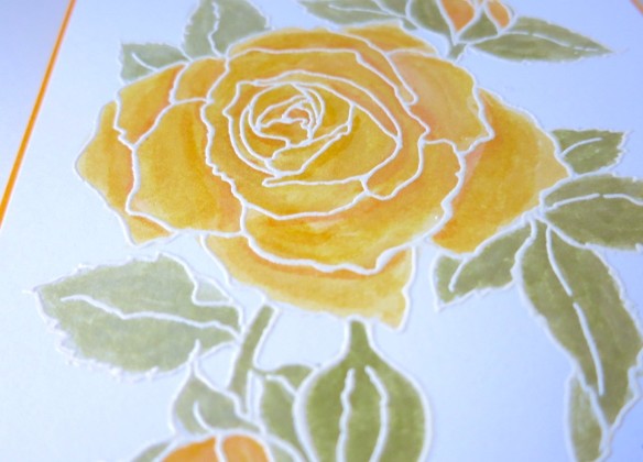
This year at Scrapbook Expo in Grapevine, TX, I took a class using Just Rite’s multi-step Wild Roses set. Instant love. The beautiful patterns and limitless color options allow crafters like me (with no real artistic ability) to add a little more magic to my cards.
These stamps are fun and relatively easy to use, but buyer be warned: some stamps sets are easier to line up than others. Some sets claim that each layer isn’t designed to fit perfectly on another and that it makes it easier to create with. I found some of those sets to be incredibly frustrating to work with. Still others had far too many layers and they created and mottled image that was hard to distinguish. Now that I’ve tried a few brands here are my favorites (saving the best for last):
- Hero Arts:
I used the Hero Arts Large Orchid set to create the Mother’s Day card below in pigment inks. Lining up the stamps was fairly easy and I found that this set was pretty forgiving if the images weren’t lined up 100% correctly. The layers came together well to create a realistic looking quality orchid stamp that I could proudly use the matching dies to cut out and use on my card.


- Just Rite:
While taking that class at Scrapbook Expo we used the Romantic Wild Rose stamp set from JustRite. I found it to be relatively easy to use and the components yielded themselves nicely to creating different scenes. This set is full of two stamp images that come together very quickly and don’t require you to have a lot of different inks to differentiate layers. The anchor points on the stamps made determining orientation easier than some of the others I’ve tried and the images laid on top of each other well using pigment inks.


- Altenew:
Talk about a knock it out of the park, holy crap where have you been all of my life product. I’ve adored (read: drooled over) every single image I’ve seen created with the Peony Bouquet and Beautiful Day stamp sets by Altenew. They’re just phenomenal stamps. The patterns are so versatile and have so much depth to them that anything created is an instant masterpiece. I’ve yet to try pigment inks with them, since the details are so intricate, but dye inks work beautifully. These sets lend themselves well to multi-layer stamping, embossing, or watercolor. The possibilities are endless!


I have several more Altenew stamp sets I’ve yet to try and I’m so impressed with the ones that I’ve used that I can hardly wait to use them! Have a favorite brand, set, or technique? Tell me about it in the comments section!
If you’re interested in any of the products I mentioned, I’ve listed them here:
- Hero Arts Layering Stamps – Large Orchid
- Just Rite Stamps –Romantic Wild Roses
- Altenew – Beautiful Day, Peony Bouquet
If you think these handmade cards are perfect for someone you know, you can find them here.
If you’d like to see any of my other products or you’d like to request a custom order, please send me a message or visit Aluminum Butterfly on Etsy.
*I’m not affiliated with any of these companies…I just like their stamps!
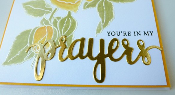
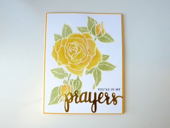
 While my image dried I took out my Prayers stamp set from Hero Arts and die cut the word from gold cardstock. Once dry, I placed my roses in my MISTI stamping tool and arranged my sentiment stamp just above where I intended to place my die cut. You don’t need a MISTI for this project, but I’ve found that I like using the gridlines to make sure my stamps are straight. I also love that if an image doesn’t stamp perfectly, I can re-ink the stamp and close MISTI again, placing the stamp in EXACTLY the same place as the last image. I find this to be an extra precaution I like to take when I’m adding a sentiment to a piece that I’ve already put quite a bit of work into.